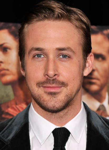
Before |
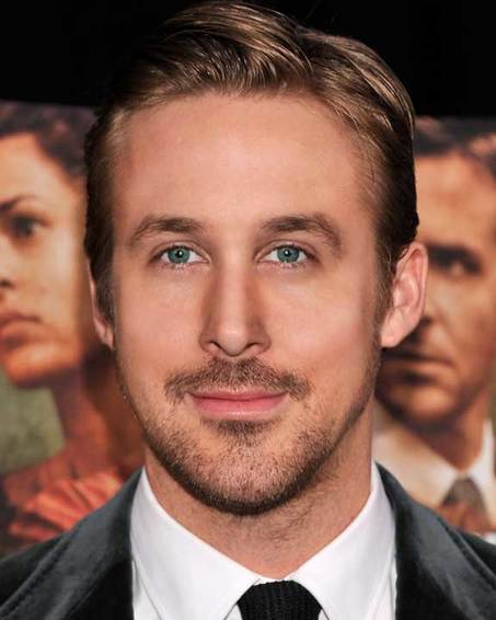
After
|
Here is a photo-shopped image of Ryan Gosling. To start, I first used the lasso tool to to make the eyes, nose and mouth symmetrical to each other. Next, I used the liquefy tool enlarge his lips and adjust his jawlines. After that, I used the clone and heal tools to remove his scars, moles, freckles and wrinkles. After this, I used the gauze tool to smooth out his skin, and to finish it off, I used the burn and dodge tool to contour and highlight his skin.
Shoe Ads
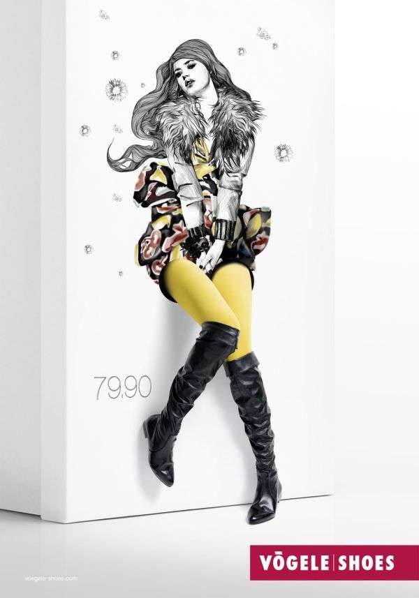
This is an ad for boots from Vogele Shoes. It is apart of a campaign called 'Box Models' where a models legs were placed through holes of a shoe box in a certain position, so that it would create a pleasing image similar to a drawing coming to life. I chose this image because it was an interesting idea to advertise shoes in a unique and creative way through art, it could almost be mistaken for a piece of art. I am inspired by this art because I think creating the idea that these shoes are something you could imagine having, say in a drawing, is a unique approach to advertising shoes. The Graphic designer of this ad used many techniques to make this ad stand out. For example, they used colour techniques by making the the tights the model is wearing under the boots a neon yellow making her legs stand out which gets you too look at the shoes in the ad. They also used blacks, whites, greys and even light reds, which made the tights one of the first things you looked at because they were so much brighter. With the model and drawing, they used a lot of body language in the drawing and with the models legs to give it a more feminine look to the drawing and the shoes so it will stand out to more women. They also used the idea of composition by creating an ad mixed with 2D and 3D looks to make the overall image stand out.
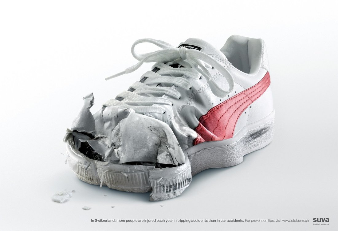
This ad was not necessarily a shoes ad, but instead an as to help prevent tripping accidents in Switzerland, since Switzerland reportedly has more tripping accidents than car accidents (I looked it up, it's true). I chose this ad because the look of the shoes is very intense, and you can really tell it's photoshop because there is no possible way a shoe could end up like that without using elements of photoshop, but I feel that also makes this ad more affective. I was inspired by this ad because there was a lot of photoshop clearly put into this ad made me not want to make my shoe look destroyed, but make my shoe really stand out when looking at the ad, but using contour, liquifying, etc to make in look good. I as well think adding shadows will also make my shoe stand out, which is obviously the goal of the shoe ads. When it comes to techniques, they used a few, including the focal point, emphasis and propaganda. First, they made sure the destroyed shoe was in the centre of the ad so that it would be the first thing the viewer looked at.
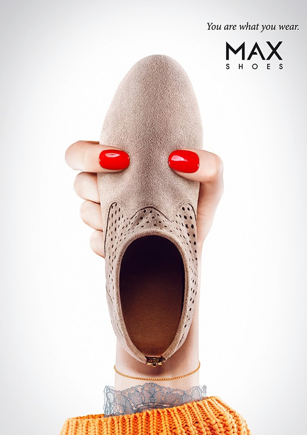
This ad was apart of a collection of shoe ads for MAX Shoes for a "You Are What You Wear" campaign. In this campaign, They used a bunch of different shoes, and placed a hand certain position to give the illusion of it being a person. I chose this ad because the illusion was very unique and intriguing, which made me able to look at this ad for a long period of time. I was inspired by this ad because it was very interesting and fun to look at, and it made you feel happy, which wanted to be my goal for my ad. For techniques, they used illusion and composition to make the show give the illusion of a person.
My Shoe Ad
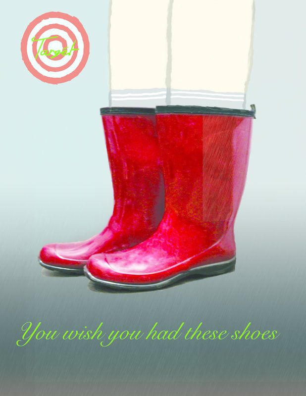
This is my shoe ad. it is an ad for shoes from Targét. To create this ad, I first took the rain boots and made them into a PNG format, after that I centred them onto my ad, and did some contouring and highlighting, as well I went through and removed the dirt and prints. I was inspired by my ads to create something fake about my ad, and I began to do that by drawing legs into my ad instead of using a photo with legs. After that, since they were rain boots, I downloaded a rain brush to put some rain on the ad. After that, I created the logo, which was a knockoff logo to Target. and to finish it off I came up with a slogan. The one thing I don't look about this ad is that the fact it is in CMYK, so its a lot more vibrant them I expected, but you learn from your mistakes.
Multi Image Pet Assignment
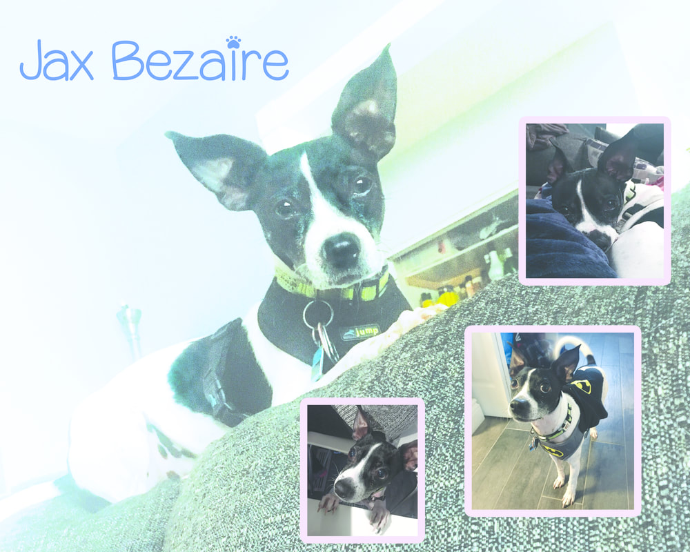
This was my multi-image pet assignment. to start, I took these photos, and edited them in lightroom. Then I put the background photo onto a layer and tinted it to make it more blue. Next, I neatly placed the other 3 images and added frames to them, and to finish, I used a puppy font for his name. The only thing I wished I would have done was lower the whites and highlights so Jax's body doesn't blend with the background.
