Shooting Assignments
Canada 150
|
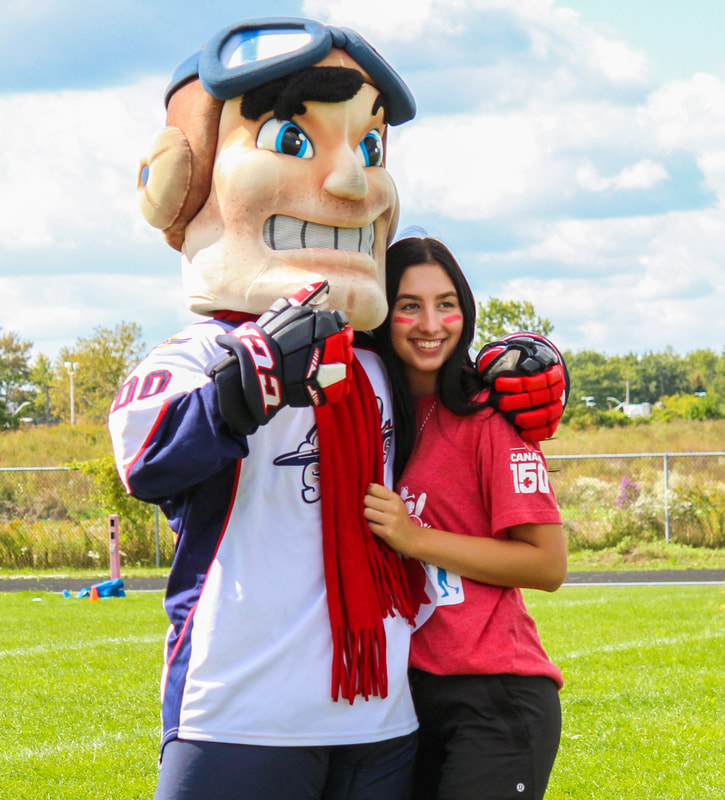
I chose this photo because because it shows a lot of Canadian spirit and the shallow depth of field. In this photo, A student is getting her photo taken with the Spitfire mascot. When I took this photo, I used a big aperture and a fast shutter speed to make this photo centre around the girl and the mascot, I also made sure their wasn't a lot of distractions in the photo so the focus would be on them, and them only. When I edited this photo, I first cropped the photo to a custom, then a 5 x 7 image to make it seem more like a portrait image, even though it wasn't taken that way. Then I white balanced the photo to show off more of the colours of their outfits. The colours that the girl and mascot were wearing contrasted really well with the background which made them really stand out, but to get even more colour contrast, I lowered the highlights, raised the blacks, and lowered and raised the whites and shadows just a little. I also raised the clarity, vibrance and saturation. This made the colours of the image pop, not just on the focus, but in the background too by making a more cloud filled sky. I also adjusted the fence lines in the back gound to make them a perfect horizontal line.
|
|
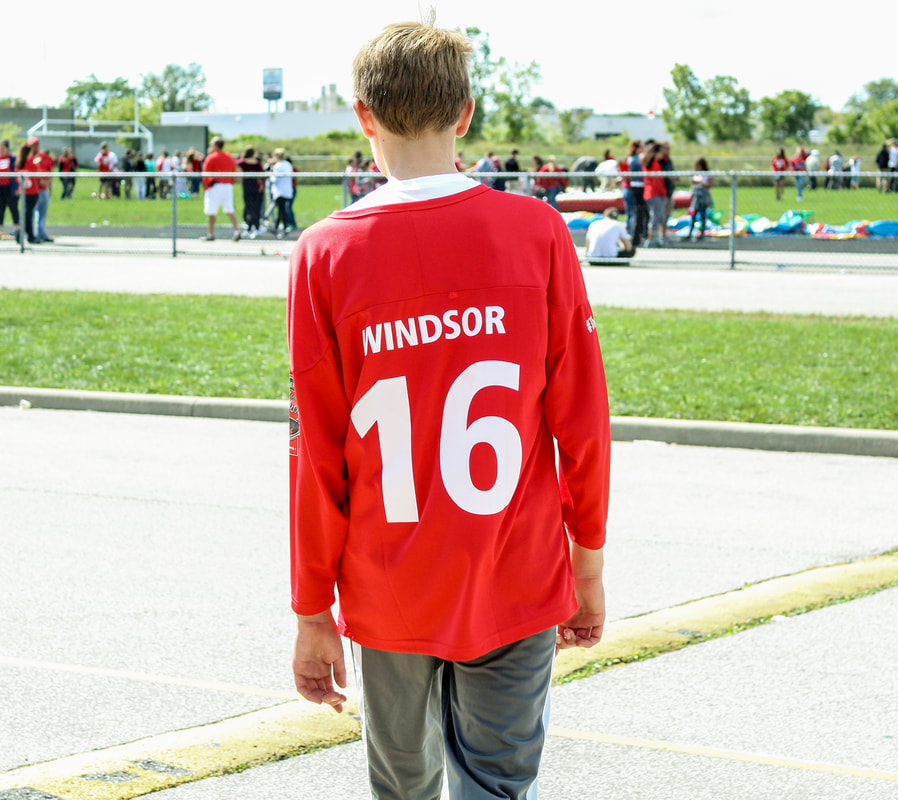
I chose this photo because I thought the jersey that Ben (student in grade 9) was wearing was the perfect shirt to wear for Canada 150, because it not only represented Canada, but it represented Windsor ON. When I took this photo, I caught this student off guard by yelling act him to "act natural" but then adjusted how he was standing to make the picture look natural in my eyes. I tried to take this picture with a shallow depth of field, but my shutter speed was too low for the look I was going for, so their was just a little bit of focus on the objects in the background, but he still stands out the most. When I edited this photo, I wanted his red shirt to stand out the most, so it would be the focus of the photo. To do this I first cropped the photo into a square like look, putting him in the middle of the 9 zone grid, to make him and his jersey the first thing you look at. Then I enhanced the colours by first white-balancing the image, and then lowering the tint. After that I lowered the highlights, raised the shadows and lowered the blacks, so his shirt would stand out and contrast with the background. And finally, I raised the clarity and vibrance. after that, I adjusted the background lines so that the curb and fence line would be parallel to each other.
|
|
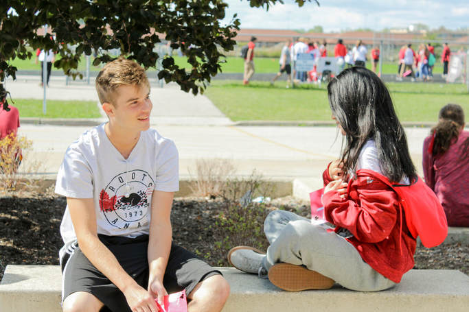
This Photo was my favorite photo that I took that day. I chose this photo because I showed it to a few people in the design class, and they all had the same reaction: "Aw that's so adorable!". When I and others look at this photo, you feel something, which makes the photo even more interesting to look at. I took this photo as a quick snapshot while looking for other things to get photos of. I saw people who looked very happy talking to each other, and I figured why not. I didn't expect this photo to look like it came out of a romantic comedy movie. Most of this photo happened during the editing process, and I didn't do to much. First I cropped the photo slightly so that the boy and girl are on the 2 vertical lines. Then I did some white-balancing to enhance the reds and whites to make it more Canadian. Even though a lot of people already thought it looked like it was from a movie, that was my goal for the picture. To do that I enhanced the colours. First I white balanced the image, and then raised the temperature and lowered the tint to make the photo brighter and more happy. After that, I raised the exposure to +0.80 to make it just a little brighter. After that I lowered the whites and highlights, and raised the shadows and blacks. Then after that I raised the Clarity, vibrance and saturation to make it more colourful.
Thanksgiving
|
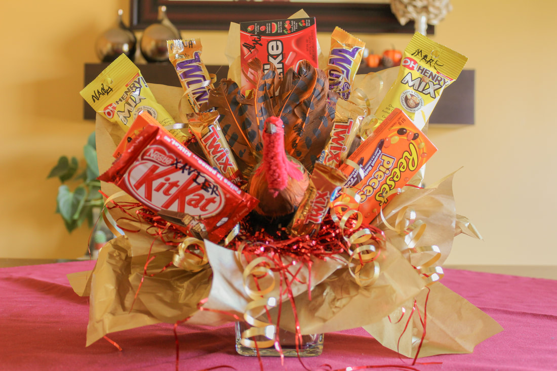
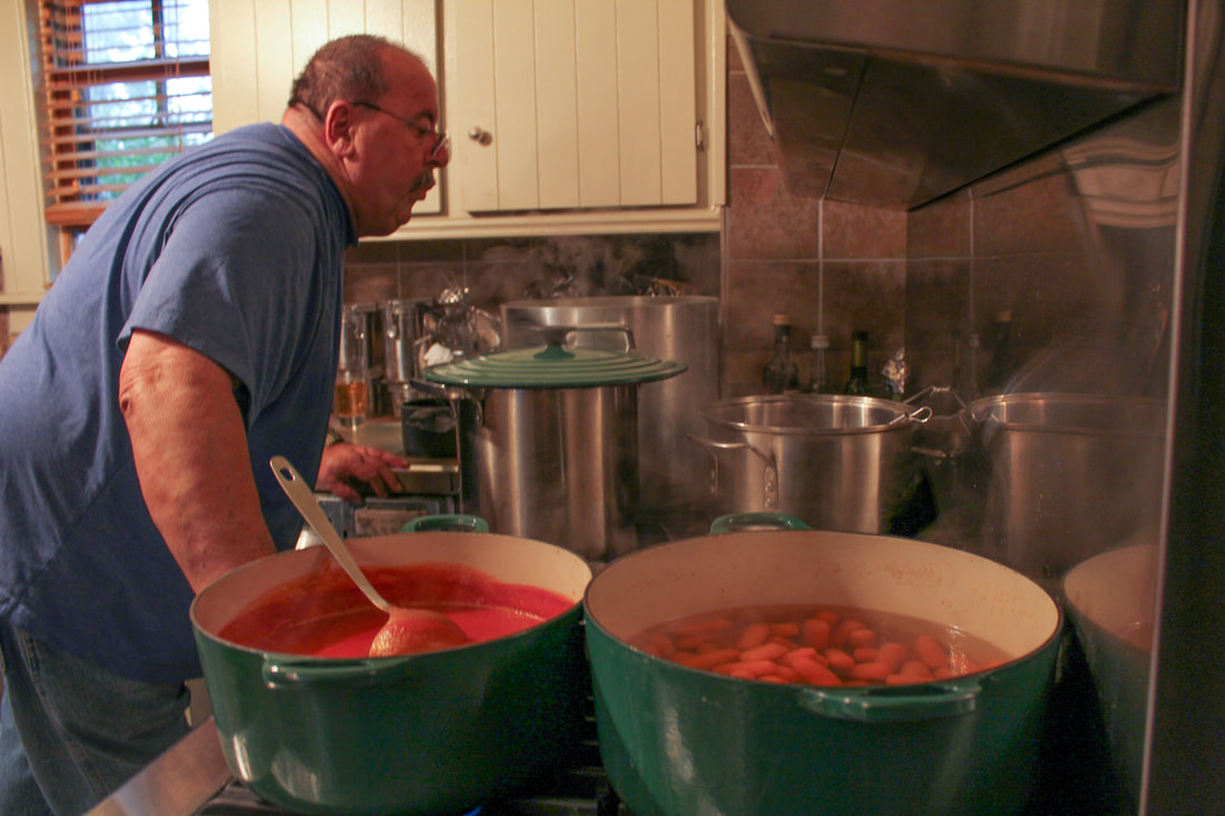
I chose this photo because I liked the center weighting and how your eye moves around because of the candy. When I took this photo, I wanted it to be center weighted so that the turkey would be the focus, and the the candy would make your eyes move from the turkey to the corners of the image. When I edited this photo, I wanted to emphasis the colors. To do this, I cropped the image, then I white-balanced the image, and made the temperature a bit warmer to get the fall colors. Then, since there was a lot of light coming from the window of the right, I lowered the highlights and whites, and raised the shadows and blacks. After all of that, I raised the saturation just a little bit, and I was all finished.
|
|
|
I chose this photo because Thanksgiving is all about food! When I took this photo, the lighting was really bad, and there was a lot of shadows, so I had to fix most of it up in editing. To fix this, I white balanced the image, then I lowered the temperature and raised the tint. Because of the lighting, the stove area was dark, almost black! So I raised the shadows and blacks to get the stove to its rightful color. After that the image looked exactly the way I wanted it to look.
|
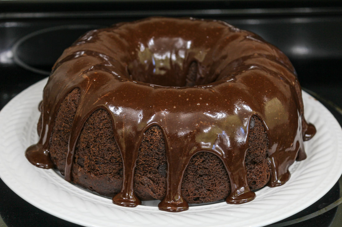
I chose this photo because I am not a huge fan of Chocolate cake, but even I think that looks good. When I took this photo, it looked nothing like this, and most of it was done in editing to brig out the textures. When I took the photo, I took it at this size, and I didn't crop it in editing. I focused on the front of the cake, so that the textures of the icing and cake were separated. When editing, I white balanced the photo. For this photo, I mainly focused on the shadows, and the presence of the image. I raised the shadows so that the plate would be a nice white, and the textures would stand out. Then to enhance the textures, I raised the clarity, vibrancy and saturation. That made the textures stand out, the icing get more of a glisten, and make the cake just look absolutely delicious.
Shadows
|
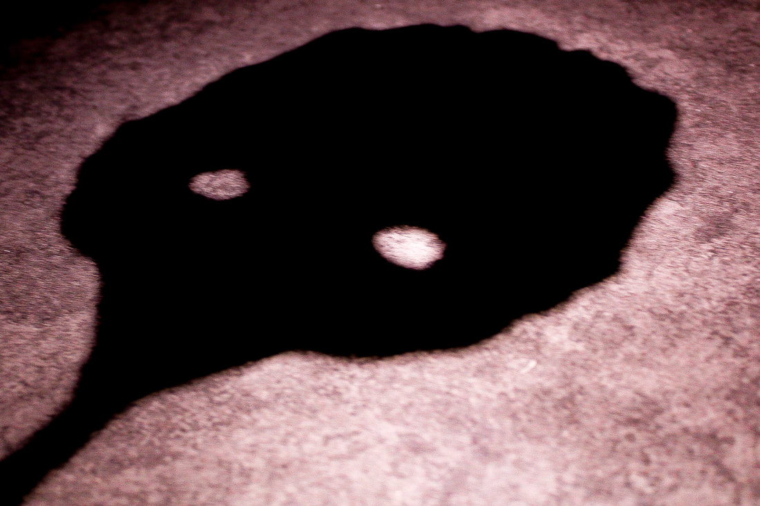
I chose this photo because I thought the shadow was very unique. To take this photo, I did it under a light in my kitchen. I used a paper bird mask that I have and put it under the light show it would show onto the counter. When I looked at the image, it reminded me of a monster, so I wanted to go with an old fashioned monster movie shot when it came to editing the image. When I edited the image, I first cropped it because there was too much headroom at the top of its head, and I also wanted the weight of the photo more to the left so it looked like it was emerging. Then I white balanced the image, and began adjusting the colours. For the colour correction, I brought the shadows and blacks right down, and the highlights and whites right up to get the 1920's monster movie look, and I also lowered the clarity. Then, I sharpened the image to get a more grainy, old look.
|
|
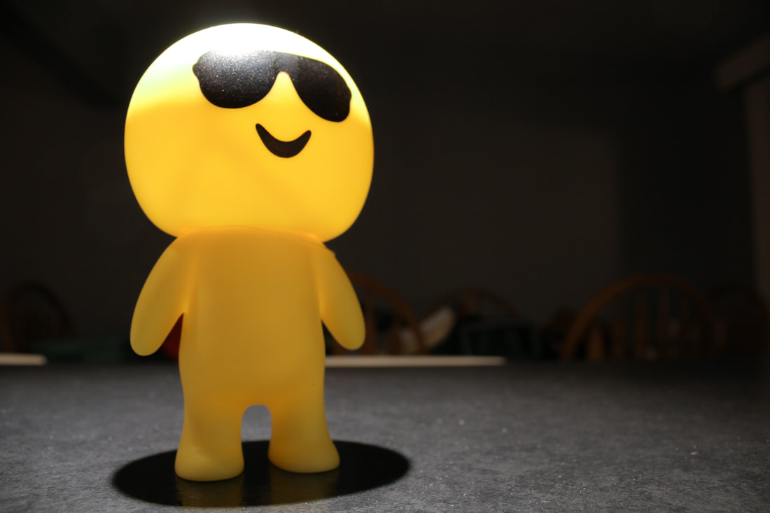
I chose this image, because I thought it was a unique take to a classic photo. I wanted to make this photo look like the photos where the person in focus looks like a more important photo. To do this, when I shot the photo, I took it from a lower angle to make the person look bigger and more of a focus, and I also weighed more to the left. When editing, I slightly raised the highlights and lowered the shadows, to get the person more in focus, lighten the top of his head to get that spotlight look, and to enhance the look of the shadows by his feet and in the background, but the background didn't really work out. Then I made the whites white and blacks black. I just really liked this photo because it seems like a street light-esque photo where you would see a person, but instead its a yellow thing with sunglasses.
|
|
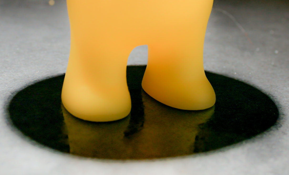
I chose this photo because when I went through the editing process, the shadow turned into a black puddle which I thought was interesting. First, I cropped the image so his feet and shadow were the main part of the image. When editing the photo, I completely raised the highlights and shadows to get the reflection of the feet, and then I lowered the blacks so the reflection would be there, but it would still have the shadows. Finally I lowered the clarity and raised the luminance and details.
Autumn
|
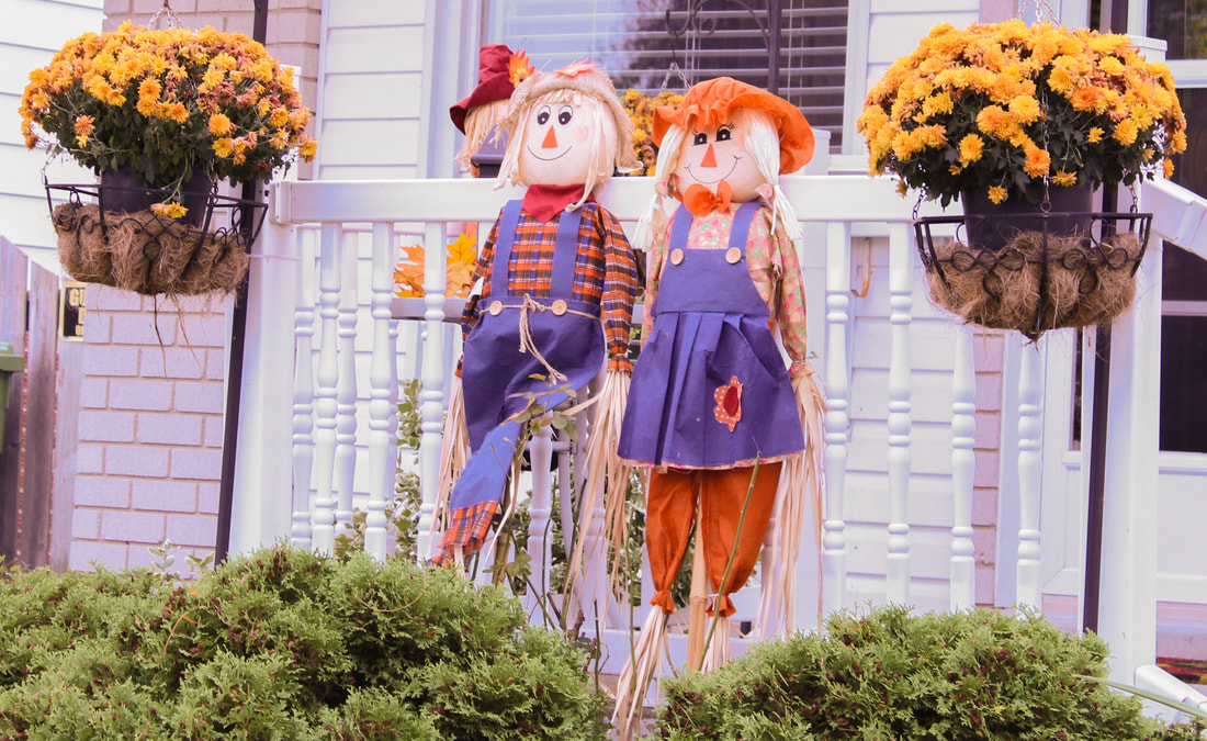
I chose this photo because as a was walking through my neighborhood and this stood out because it was the only house that wasn't mainly decorated for Halloween, it was decorated for fall. I also thought that the scarecrows looked adorable. To edit this, I first cropped the image because it was taken a bit farther away, so there was a lot of unnecessary things in the background. After that, I white balanced the image, as well as I lowered the highlights and whites, lowered the shadows just a little, and raised the blacks, because the image was also taken in very bright light. After that, I enhanced the clarity and vibrance to make the oranges and blues stand out.
|
|
|
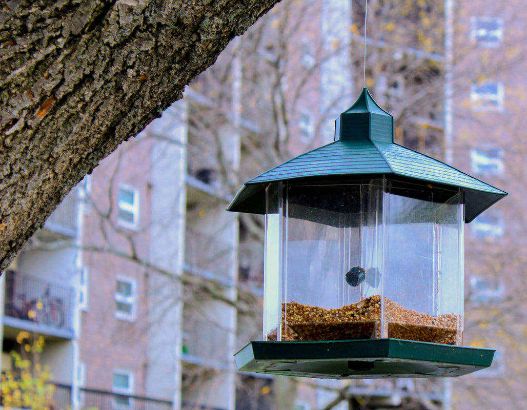
I chose this photo because I liked the weighting and focus of this photo. Before I took this photo, there was a bird on this feeder, which made the feeder stand out, but where I got there it flew away. I still liked the look of the feeder, so I took a quick photo. when I checked the photo and started editing, the photo looked really good. To edit this image, I first white balanced, and made the temperature +30, and tint, -27. After that, I lowered the highlights , shadows, white and black to make it look more rustic and modern, and I finished it off by raising the clarity, vibrance and saturation.
|
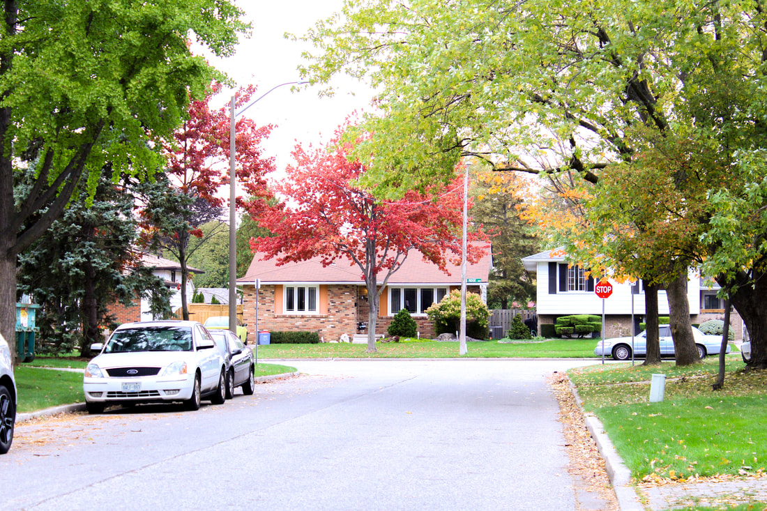
I chose this photo because I liked the bright colours and textures. I took this photo because I felt with a lot of editing I could take this originally colourless image and turn it into a beautiful photograph. To edit this photo, I first cropped the image and then adjusted the angle so that the street would look more straight. Then, I white balanced the image so the temperature became warmer. After that I removed the highlights, raised the whites, and lowered the shadows and blacks to the same -44 so I could get a brighter image, and after that to finish it off, I raised the vibrance and lowered the clarity to enhance the colours even more.
Halloween
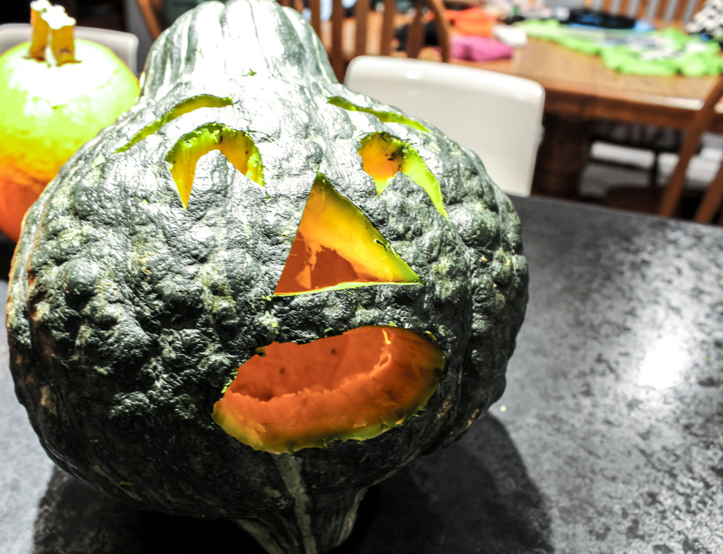
|
I chose this photo because I liked the face the carving was showing. I took this photo because usually we do pumpkin carving, but because we got our pumpkins so last minute, we had to buy one gourd. My mom carved the face and I thought it was very funny, which gave me an idea for editing. My goal through editing this photo was to make the the viewers feel scared, but in a comedic way. First, I cropped the image, and adjusted the lines so they were on a slant, because having lines that aren't perfectly straight can enhance fear. I also white balanced the image and lowered the temperature to get more of a colder feeling. To make it more comedic, I lowered the highlights, raised the shadows, raised the whites and lowered the blacks to get a confusing look. Finally, I raised the clarity and saturation and lowered the vibrance to finish off the photos.
|
|
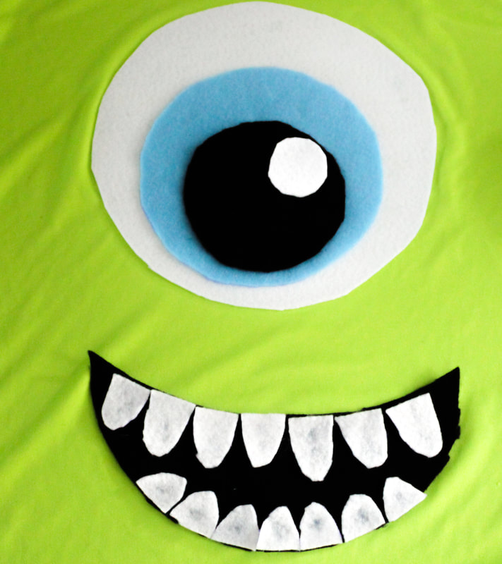
I chose this photo because one: I love Disney, and two: I wanted to try taking a negative/positive space photo. This photo is a close up of my Mike Wazowski costume I wore for halloween. First, since his face was on a shirt, I needed to crop the image, but the one thing I didn't like was that since the shirt was inside out, there were lot of seems, so i had to crop the image as close as possible, but I feel I did well nonetheless. After white balancing, I raised the highlights and whites so that his sclera and teeth would be as white as they are in the movies. I also lowered the shadows and blacks so his mouth and pupil would be a perfect black colour. The only issue was that because I needed the eye and mouth to look good, the wrinkles of the shirt began to stand out, bit because it was a shirt they are hard to get rid of. When I was finished, I lowered the clarity to lower the amount of wrinkles in the shirt, and raised the vibrance to get the Disney colours to be apart of the image.
|
|
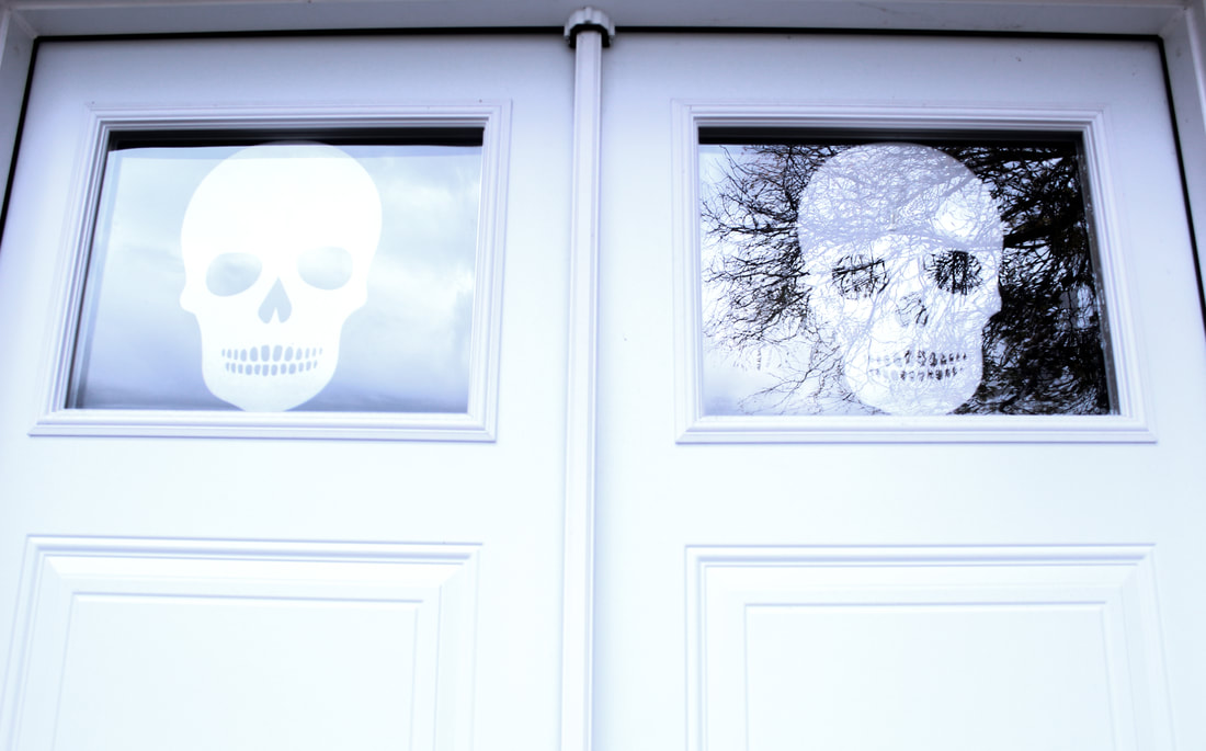
I like this photo because of the lines and reflection of the sky and trees through the window, and I personally feel it gives the viewer a very spooky vibe. As well, the colors scheme of this photo (white, grey, indigo, black) gives me the Halloween vibe as well. When editing this photo, I white balanced the photo, raised the temperature and lowered the tint. Then I lowered the highlights, shadows and blacks and raised the whites. Finally I raised the clarity and lowered the vibrance. I feel the editing to this was very simplistic, but I feel that the photo still looks amazing even with the subtle edits.
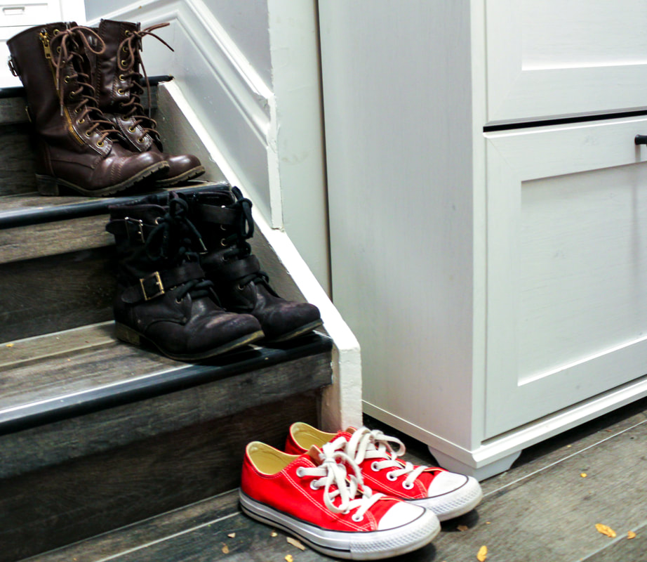
Shoes
|
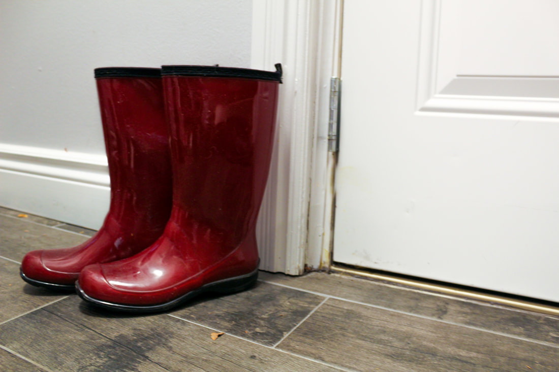
I chose this photo because I really liked the colours of the boots, so I wanted to emphasize that in this photo. When taking this photo, my goal was to make the boots look like they naturally there all the time, but also let them stand out. When I edited this photo, First I white balanced the image. Then, since the colours of my door were a bit yellow, I raised the highlights and lowered the whites just a little to get a natural door, as well as used the heal took to take out some of the dirty colours so the door would be a solid white. Finally, I raised the vibrance so the colour of the boots would be very bright, making them stand out.
|
|
|
This is a photo of all of my shoes that I wear often, I liked this image because of the consistent lines all going in a certain direction, as well, the colors of the image. The colors were only enhanced in editing, but I liked how they made the red converse shoes stand out. For this photo, I white balanced, and then lowered the temperature and tint to enhance the cooler colors. After that I lowered the highlights and whites to get ore dark colors, and raised the whites to see the exact looks of the shoes and not completely darken the cabinet. To finish it off I raised the vibrance to have the red shoes stand out.
|
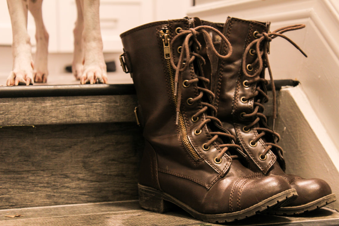
This is photo of my combat boots. I like this photo because of the color scheme I chose when editing and the positioning of the shoes and stairs, but something I don't like is my dog's feet photobombing this photo because they were something I couldn't Photoshop out, and were really distracting, but I still feel that they looked good with the look I went with. My goal for the look of this photo was a very earthy, grungy look. To do this I first white balanced the photo, and then raised the temperature and lowered the tint to get a greenish brown, earthy tone. I also raised the exposure to enhance the detail in the shoes and staircase. Next, I lowered the highlights and shadows, as well raised the blacks to keep the dark colors more prominent. I chose to leave the whites the color that they were because when adjusting them to make them more white, it ended up being a distraction for the rest of the image, so the whites are at 0. To finish it off, I raised the clarity to enhance the tomboy look of this photo. When I see raised clarity, I think of tomboy, nature, and action, which are things I was thinking of when I used these shoes for the image, and this is why I like this image.
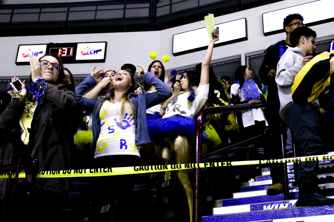
Catholic Cup
|
This was one of my favorite photos from catholic cup because of all the action going on. People screaming, clapping, cheering, it just screamed school spirit. When I saw this photo, it made me think of two of the photos on Sabrina Sisco's website for her catholic cup shooting assignment, because of all the emotion going on in the image. Apart of a theme with all my catholic cup photos, I wanted the color scheme to be bright, enhancing the school colors of white yellow and blue. When I took this photo it was really dark, so there was a lot of editing that needed to be done. To edit this photo, I first cropped out the top since it was empty space, and then white balanced, raising the temperature and exposure to lighten and brighten the image. After that I raised the highlights and shadows an whites to create a more action packed image, and lowered the blacks. I didn't end up needing to enhance the presence of the image because the whites really brightened the image since I had it set to 100, but though that extremely brightens the image, it doesn't completely take over.
|
|
I liked this image not necessarily because of the editing or shot, but because of the people in it. I don't know thee students, but they have amazing smiles and they make you happy when you look at the photo. For this image, I wanted the image to be as bright as their lovely smiles. When editing, I white balanced this photo, and then adjusted the temperature and tint to match the theme and color scheme of the other photos. After that, I slightly raised the highlights and lowered the whites, but intensely raised the shadows and blacks since there was so much blue in this image, I wanted it to be the stand out color. To finish it off, I raised the clarity to make it more sporty since they were at a hockey game.
|
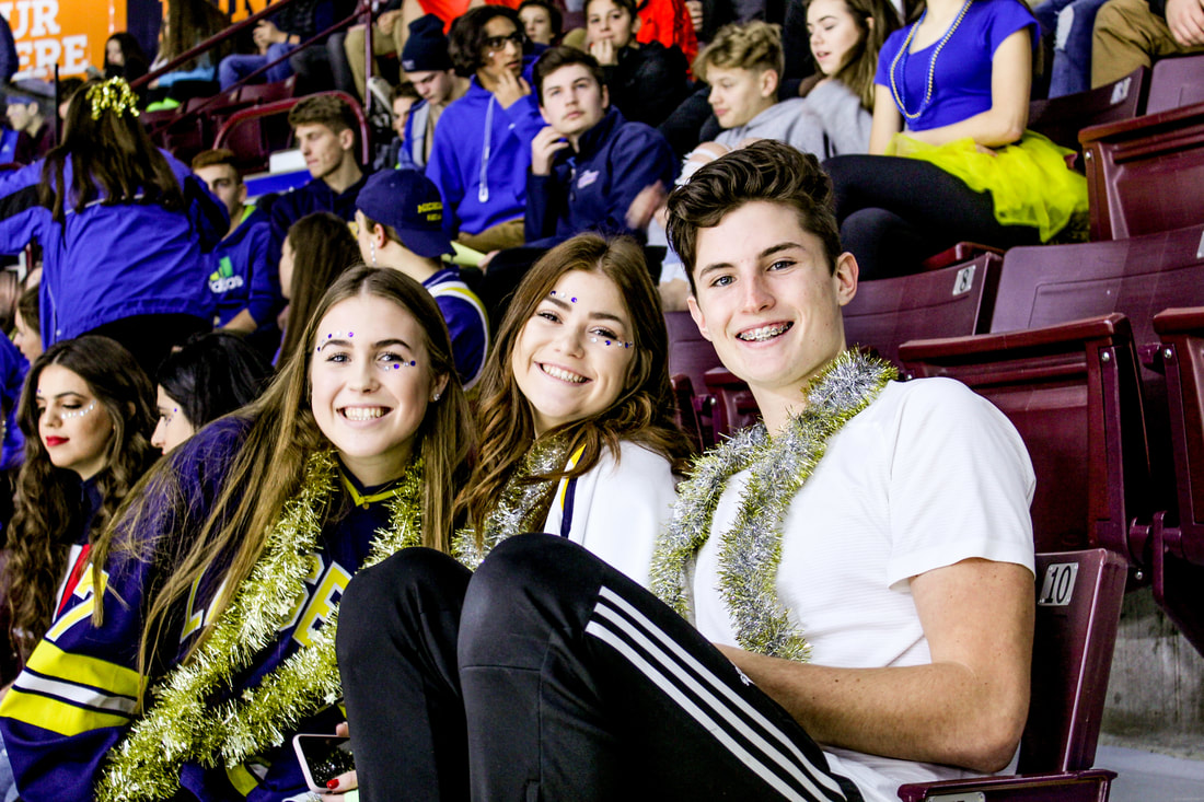
|
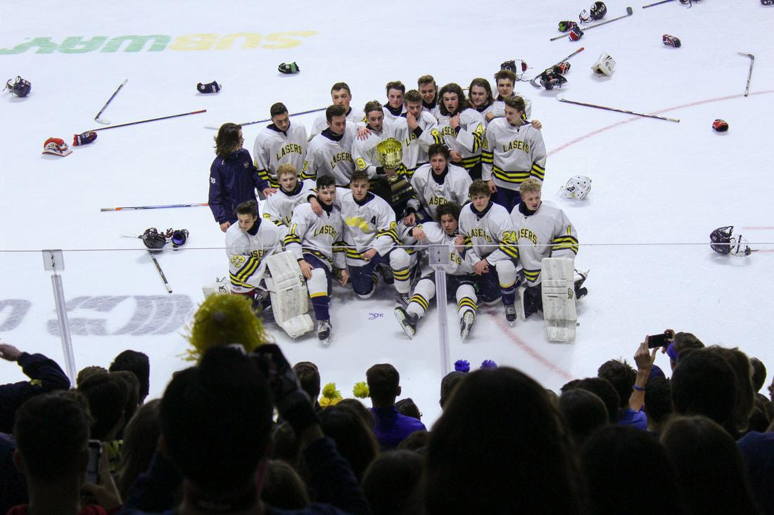
This image 100% had to be on my website; Our laser hockey team as they posed with the catholic cup. For this photo, along with following the theme, I wanted to have the spotlight on them, so when taking the picture, using the aperture and shutter speed, I was able to make the audience slightly darker than the players, making them the stars of the photo. When editing, I white balanced to get the photo to match the theme, as well as raise the exposure to make the hockey team brighter. After that I lowered the highlights and raised the shadows to get the more movie like look to the image, making me think of the ending of a sports movie where everyone is cheering in slow motion (which was something I wanted to try with one of my sports images), and then lowered the clarity to -5 just to make the image look less clear, but not so clear to the point it was out of focus.
